New Logo and Branding:
On December 20, 2020, we unveiled our new logo and branding. As we head into a new year and a new chapter in Northlake’s history, we believe it is the perfect time to update our look as we seek to build God’s Kingdom, one soul at a time.
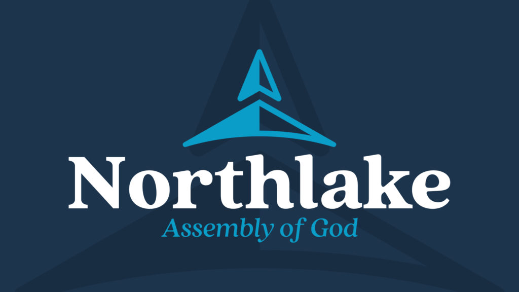
Our new logo is designed around simplicity with the intention of representing our goal of pointing people to Christ. In the logo mark, you’ll find a church steeple in the shape of arrow. Similar to a compass format, this arrow is pointing north which is a wink to the name Northlake. The arrow is also pointing up, representing that everything Northlake AG does is for the glory of God. Northlake AG exists to be the fingers pointing to Christ. There are shadows and different shades on both sides of the mark, which represent the multicultural unity of Northlake AG, both now and in our future ahead. Our colors, multiple shades of blue, connect to our regional identity and create an additional link to the lake in our name. These colors were chosen purposefully to attract attention but not distract. Featuring a unique base color of vibrant navy, fused with an accent color of an electric blue, the palette is designed to compliment, not overwhelm, our desire to draw attention towards Jesus and His gospel while also displaying the life of the church.